Action Awards
Company Website Redesign

Overview
Established in 1973, Action Awards aimed to provide personalized items for their community. However, the website hadn't been updated since the early 2000s and needed to be modernized to uphold their vision of "partnering with people to promote their purpose".
Role
Product Designer
Tools
Adobe Illustrator, Shopify
Website
www.actionawards.com
Problem
The company's website had not undergone any updates since the early 2000s, which resulted in an outdated design that made it seem unsecure and unreliable, ultimately leading to a loss of sales.
Solution
To develop a more efficient website that could effectively promote the company's vision, a new website was created using Shopify. This e-commerce platform was selected for its simplicity and convenience for both customers and administration.
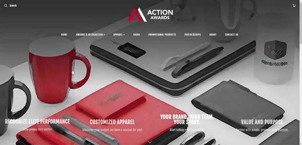
A Sleek Homepage Redesign
The redesigned homepage boasts a modern layout and clear navigation, enhancing user accessibility.
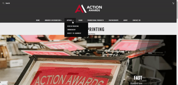
Navigation to Detailed Services
Visitors can swiftly understand all of the company's services through the navigation menu and detailed pages, ensuring a seamless and engaging experience.
Approach
Our approach to redesigning the company's website involved conducting user research to gain insights into customer needs and preferences. This was then used to create user flow diagrams and inform our design decisions. We tested our prototypes with people and incorporated feedback into the final design.
User Research
We conducted user interviews on 4 employees and 6 customers. The goal was to identify areas of improvement from the previous website.
User Interview Goals
-
Understanding the needs and pain points when interacting with the current website
-
Obtaining feedback on the design, layout and navigation of the current website
Key Findings from User Interviews
-
The outdated website design and graphics make it less trustworthy
-
Navigating the website is confusing
-
Very confusing and inconsistent layout
-
There is too much text that is also hard to read
User Flow Diagrams
By conducting user research, we obtained valuable insights into users' priorities, which we utilized to develop user flow diagrams and guide our design decisions.

Design Decisions
A branding guideline and system needed to be created. This consistent theme would include a red and a few grey tones.
With the typography, different variations of Fjalla One were used throughout the website for legibility and consistency. The sans serif font modernizes company.

Usability Testing
Performing usability testing with stakeholders on the prototype identified pain points, gauges user satisfaction, and provides actionable insights to enhance the overall user experience, ensuring the redesigned website is both intuitive and user-friendly.

Result
While the redesign didn't boost sales directly, it reduced navigation queries and doubled website traffic within six months. The new site's modern design and intuitive navigation attracted more visitors, indicating a successful revamp.
5000
visits compared to previous yearly average of 2000
=
150%
Increase in website traffic in the first 6 months

Future Plans
The website had been developed on Shopify, providing the flexibility to easily transition into an e-commerce website in the future. This allows the company to add products for purchase whenever they are ready to do so, without the need for another complete overhaul of the website.

