Primerica Store
E-commerce Website Redesign

Overview
Primerica Store, a collaboration between Primerica and Action Awards, offers promotional products online. Despite sales, its dated design led to user confusion and potential revenue loss. The redesign aimed to modernize the site, enhance navigation, and align with Primerica's branding, ensuring a seamless customer experience.
Problem
The company's website faced challenges with unclear navigation, an outdated design, and a malfunctioning search function. Users struggled to locate products due to inadequate filtering options, leading to user frustration, decreased engagement, and reduced sales conversions.
Solution
The website underwent a full redesign using Shopify, chosen for its ease of use, modern design, robust search features, and secure checkout.
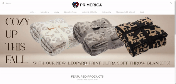
Modern Design
The update to the e-commerce website enhanced user experience and boosted sales, reflecting a successful digital transformation.
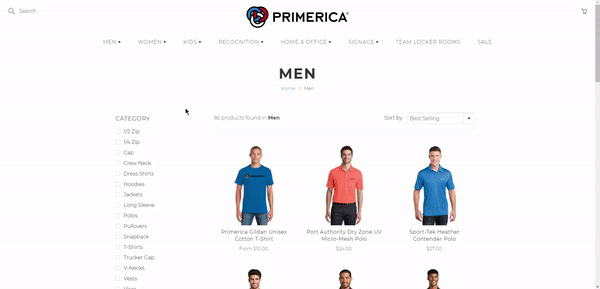
Swift Product Discovery
Beyond a functional search feature, enhanced filtering options streamlined product discovery for customers.
Approach
I initiated the project with user interviews to identify key challenges. After optimizing the website's structure for user-friendliness, I crafted screen designs aligned with the client's brand and UI/UX best practices. Usability testing further refined the design by highlighting areas for improvement.
User Research
User interviews were conducted with 10 customers and 6 stakeholders to try and pinpoint the primary concerns of the previous website.
User Interview Goals
-
Understanding user needs and preferences related to the shopping experience on the website, such as product search, browsing, and checkout process.
-
Identifying pain points or challenges users face when using the current website, and areas where the redesign could improve the experience.
-
Gathering feedback on website features or design elements that users find most helpful or important, as well as those that they find confusing or unnecessary.
-
Exploring user expectations for the website in terms of brand identity, visual design, and overall user experience.
Key Findings from User Interviews
-
There were too many items on the vertical navigation menu
-
There was both a horizontal and vertical navigation menu
-
The search feature didn't display the correct results
-
Navigating the website was confusing
-
Product descriptions were inconsistent
-
The checkout process did not look secure or modern
-
Some product images were low resolution
Information Architecture
The main priority for the redesign of the website was to ensure that it was easy for customers to navigate, especially with over 300 products. To achieve this, I created an information architecture to provide stakeholders with a clear visualization of the pages and screens.


Screen Designs
Sketching screen designs was an essential part of this design process as they serve as a quick mockup for stakeholders and help guide prototyping efforts. They also ensure consistency in the design by providing a visual reference for each screen.

Website Style Guide
Establishing initial design elements and standards enabled a faster and more consistent design process. It was especially critical given the 300+ products that required inclusion on the website. Having a clear protocol for adding new products helped ensure a cohesive and streamlined user experience.


Usability Testing
I conducted usability tests with stakeholders and select customers to gather valuable feedback, which I used to make refinements to the website design.

Result
In just 8 months, the website's redesign not only modernized its appearance but also boosted user experience, leading to increased sales and traffic. Transactions rose from a weekly average of 50 to 75. Enhanced search and filtering made product discovery effortless, and with Shopify integration, payment security concerns were addressed.
50%
increase in number of weekly transactions

